Monday, July 29, 2013
Lesson #150: Responsive Web Design for Multiple Devices
In this day and age of multiple devices, mutliple platforms and multiple screen sizes, Responsive Web Design (RWD) has become the web designers' go-to strategy for building web sites. For this post, I enlisted the help of my colleague, Eric Nardo, the Creative Director at Ora Interactive, whom I am grateful for his deeper education on this topic.
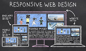
First of all, what is RWD? It is the process of building your web technologies in a way that it will automatically reformat itself based on the inbound platform a user is using. This means updating the page width, font sizes, displayed text, navigation bars and other elements to easily and quickly resize and optimize the site for PCs, tablets and mobile phone screen sizes "on the fly". No longer do you need to build a stand-alone mobile touch sites, or incur addition costs building different versions of your sites for the various platforms. And, the good news: it is no more expensive than building non-responsive sites, so there really is no reason not to be doing it.
RWD first hit the stage in 2010, with Ethan Marcotte's book on the topic. But, it really did not go mainstream until the middle of 2012, when many of the big web browsers started to support CSS3 (since RWD is dependent on media queries using this cascading style sheet technology). It is now the default preferred solution for any good web design.
So, if you are not building your new sites, or rearchitecting your old sites, using RWD frameworks, you really need to look for new professional technology assistance, as you may be materially impacting your user's experience on your sites, depending on what devices they are using. It is critical you customize your user experience to the devices your users are using to optimize the user experience, word of mouth marketing benefits and conversion rates for additional revenues. All you have to do is look at you Google Analytics data to realize 30-40% of your inbound traffic is coming in via mobile devices today, not PCs!!
The most-popular RWD frameworks come from the Zurb's Foundation, Twitter's Bootstrap and Dave Gamache's Skeleton. Zurb's is the "grand daddy" of the industry that has the most features and is on the leading edge. But, it is the most complex and hardest to learn and use. Bootstrap is the middle grade, with a lot of customizable buttons and menus, too. But, if you don't think you will use those functionalities, Skeleton, like its name suggests, is a "bare bones" framework for your simplest of needs. Making it many designer's favorite, given its quick and easy use. That said, there are scores of other frameworks out there, and you can also try to code this functionality yourself, if you are a good coder. But, don't re-invent the wheel if you don't have to, with good open source options available out there.
To be clear, RWD does not replace the potential need for developing stand-alone native apps for smart phones and tablets. Native apps run locally on the device, and do not require connectivity to the web, where performance can be spotty. And, native apps can directly tap into the device's hard drive, memory, storage, GPS targeting, voice/email/SMS functions and integrate with users' other mobile apps, like their social media connections, where RWD does not. So, for rich media applications, like gaming, nothing will perform better than a native app.
For further reading on this topic, check out the book "Responsive Web Design" by Ethan Marcotte and this blog post by Pete Cashmore at Mashable.
If you need any further assistance, or are looking for a professional developer for your RWD needs, Eric Nardo at Ora Interactive is happy to help at eric@orainteractive.com or 312-854-7096.
For future posts, please follow me at: www.twitter.com/georgedeeb. If you enjoyed this post, please click the social sharing buttons to share with your social networks.

